

Table of Contents
In a hall with no window, a colour is never seen in daylight: it is worth only what your bulbs give back. Choose it on its light reflectance value, 70 to 80 for a white against 4 for a black, then check how it behaves under 2,700 K. A dark colour still works, as long as you raise the lumens.
The hall is the room you walk through most and paint last. In a lot of Irish houses it is also the only room with no window of its own: the daylight it gets arrives through the glass panel in the front door, a fanlight above it, or the open door of the sitting room. Whatever colour you put on those walls will almost never be seen in daylight. Most hallway paint guides hand you a list of fashionable shades, and none of them says what actually decides the result: in a hall with no window, a colour only exists through the artificial light that hits it. This guide ranks colours on what they send back, explains what a warm white bulb does to them, and shows the one condition under which a dark hall is still a good idea. For the fittings themselves and where to put them, we have a separate guide to hallway lighting.
A hall with no daylight is not painted like any other room
There is only one light, and it is yours. In a bedroom, a colour is seen at 6 a.m. under a grey sky, in the afternoon under low sun, and in the evening under a 2,700 K bulb: its faults average out. In a hall with no window, it is only ever seen under your bulbs. If the match between the paint and the light source is wrong, it is wrong every hour of the day.
The walls fill almost the whole field of view. An Irish hall commonly runs 1 m to 1.3 m wide under a 2.4 m ceiling. Walking through it, you have two large coloured surfaces less than an arm’s length away on either side, and very little floor or ceiling in your line of sight. The colour on those walls does not decorate the hall, it defines it.
The light bounces before it reaches your eye. In a space that narrow, a good part of what you see is not the light that left the fitting but the light that hit a wall and came back off it. A wall that absorbs puts out the whole space. It is the same mechanism we describe in our guide on how to brighten a dark room, only sharper, because the surfaces are closer.
The practical consequence: the colour card you hold up in the shop is lit to 4,000 K and 1,000 lux or more. Your hall will sit at 100 lux under 2,700 K. It is not the same colour.
Light reflectance value, the one number that ranks hallway paint colours
Light reflectance value, written LRV, is the share of light a surface sends back, on a scale from 0 to 100. A wall at 70 returns 70 per cent of what it receives; a wall at 10 returns 10 per cent and keeps the rest. Irish and British paint ranges print it beside the colour name, which makes it the only figure that lets you compare two shades without arguing about taste. Lighting standards express the same thing as a reflectance between 0 and 1: an LRV of 70 is a reflectance of 0.70.

The reference ranges for emulsion paint fall out like this:
| Wall colour | Light reflectance value | What it means in a hall |
|---|---|---|
| White | 70 to 80 | Sends back almost everything. No extra lumens needed. |
| Yellow, cream, light beige | 50 to 70 | Nearly as efficient, and far warmer. |
| Grey | 35 to 60 | Depends entirely on how pale it is: a twofold gap. |
| Green | 30 to 60 | A pale sage goes anywhere, a forest green does not. |
| Brown, terracotta | 25 to 50 | Warm under 2,700 K, but it eats light. |
| Blue | 20 to 50 | The family that suffers most under warm white. |
| Red, burgundy | 20 to 35 | Striking, and best kept for a short hall. |
| Black | 4 | Sends back 4 per cent: the hall becomes a tunnel. |
Two more markers complete the table. A very pale wallpaper, white or cream, sits between 65 and 75, level with a white emulsion, while a dark wallpaper can drop to 5. On the joinery side, a pale varnished oak returns 40 to 50 and a dark varnished oak only 15 to 40: dark doors weigh as much as a wall.
The European standard for lighting indoor work places, published in Ireland as I.S. EN 12464-1, gives useful bands: 70 to 90 on the ceiling, 50 to 80 on the walls, 20 to 40 on the floor. It is written for offices rather than houses, but it sets an honest order of magnitude. As soon as both your walls fall below 50, you have to make it up with light.
What 2,700 K does to the colour you picked
A colour does not belong to the paint: it is the product of what the paint sends back and what the lamp puts out. In a hall the lamp is almost always a warm white, around 2,700 K, and for a good reason: the hall serves the bedrooms, and cool light at night wakes people up. Lighting engineers file everything below 3,300 K as warm in appearance, 3,300 to 5,300 K as intermediate, and anything above that as cool.
A warm white holds proportionally less blue than a 4,000 K neutral white, and every colour family feels that differently. Blues and cool greens lose their colour: a blue grey chosen off a card under neutral light turns a flat, dull grey, which is a double penalty for a family whose reflectance is already low. Terracottas, ochres and pink-leaning beiges gain instead, because the warm end of the spectrum saturates them. Pure whites drift towards cream, which is no bad thing in a hall, unless you picked a slightly blue white to look crisp: it will read as dirty grey. Coloured greys are the least predictable of all, and the only ones you absolutely have to try on the wall itself.
When it happens between two surfaces, the effect has a name: metamerism. Two colours can look identical under one light and clearly different under another, because their reflectance spectra differ. That is why a paint and a floor covering chosen in two different shops rarely sit well together once they are both in the hall. We go into the mechanism in our guide to what colour goes with green, the most sensitive shade of the lot.
The second figure to read on the box is the colour rendering index, written Ra or CRI, which compares the colours a lamp renders with those of a reference source on a scale running to 100. To walk through a hall, the index hardly matters; to see the colour of its walls, it matters a great deal. In a hall whose colour you have chosen with care, aim for Ra 90: below that, the shade you paid for is not the shade you will see. It is the same reasoning as in our guide to wardrobe lighting, where the job is to tell a navy from a black.
One case to settle before you open a tin: if your hall or the landing above it still runs on an old fluorescent batten, change it first. Those tubes carry indices that drop to 60, and a tube near the end of its life drifts pink or greenish, so you would be judging your paint under a false light. Our guide explains how to test a fluorescent light starter and whether the fitting is still worth repairing.
Hallway paint colours that hold up without a window

Cross the reflectance value with the behaviour under warm white and six families come out ahead.
- Warm off-white, cream or eggshell. The safe bet: 70 to 80 LRV, and the touch of yellow in it stops the hall looking clinical under 2,700 K. The default choice when the hall is long or very narrow.
- Greige and pink-leaning beige. Around 55 to 65, they keep nearly all of the white’s advantage while adding some substance, and their warm undertone is exactly what 2,700 K saturates. The shade we recommend most often.
- Pale sage green. Between 45 and 55, the only green that is genuinely comfortable without a window: the yellow in it holds the colour up where a blue-leaning eau de nil goes out.
- Light terracotta and greyed apricot. A middling reflectance, around 40, but the colour gains so much under warm white that the hall feels more welcoming than it would in a paler grey. Keep it for short halls.
- Warm grey, with a beige undertone. Around 50. Avoid the blue-leaning greys, which fall flat: hold the two cards side by side, and the one that looks slightly dirty is the right one.
- Deep blue and forest green, on one wall only. Between 10 and 25, they are out of the running for a whole hall, but they become an asset on the end wall, lit.
Three choices, on the other hand, cost you dearly: a blue-leaning brilliant white, which greys everything under warm light; charcoal on both walls, which divides the usable light by three; and heavily saturated colours, which throw their cast back onto faces and onto everything you carry through.
Going dark, on condition that you raise the light

A dark hall is not a mistake of taste, it is a trade-off. A deep colour gives a passage a presence that white will never have. The price is right there in the table above: going from a greige at 60 to a forest green at 20 means sending back three times less light in a space where light does almost nothing but bounce.
Our house rule: allow roughly 200 installed lumens per square metre to reach the 100 lux the standard sets for a circulation area, with pale walls. Then correct it.
| Hall | Floor area | Pale walls, above 60 LRV | Mid walls, 30 to 60 | Dark walls, below 30 |
|---|---|---|---|---|
| Small, 1 m x 3 m | 3 m² | 600 lm | 750 lm | 900 lm |
| Average, 1.2 m x 5 m | 6 m² | 1,200 lm | 1,500 lm | 1,800 lm |
| Long, 1.2 m x 8 m | 9.6 m² | 1,900 lm | 2,400 lm | 2,900 lm |
| Entrance hall, 2 m x 3 m | 6 m² | 1,200 lm | 1,500 lm | 1,800 lm |
The full calculation, room by room, is in our guide to how many lumens you need. Three conditions go with the extra output.
The ceiling stays pale, and the light has to reach the wall. The standard asks for 70 to 90 on the ceiling: it is the one large surface still sending something back once the walls have stopped, and painting it the colour of the walls turns the hall into a box. As for the colour itself, with no light on it, it reads as a black mass. A wall light that is open at the top and the bottom draws two halos on the paint and brings out its texture: that is what makes a deep shade exist at all.
You multiply the light points, you do not strengthen one. Three sources of 400 lumens spread along the length beat one of 1,200 lumens in the middle, which gives you a pool of light and two dark ends. Interior wall lights with a shallow projection are the simplest answer in a narrow passage; under a low ceiling, compact hallway ceiling lights repeated every 1.5 m do the same job. On the paint side, a satin or a soft sheen catches the light and gains a few points of reflectance on the same pigment, and it wipes clean, which matters in the one room where everybody brushes past the walls.
Adding a light point is electrical work. Moving a switch, adding a wall light or running a new circuit to the hall falls under I.S. 10101, the National Rules for Electrical Installations, and should be carried out by a Registered Electrical Contractor listed with Safe Electric. Swapping a bulb or changing a fitting on an existing point is another matter, with the power off at the consumer unit. Moving the fitting itself, rather than the point, is covered in our guide to the off centre pendant light.
The compromise we suggest: the two long walls in greige, and the end wall in a deep shade, lit. You get to be bold without building a tunnel.
Which colours make a narrow hallway look bigger
Making a hall look bigger is an optical illusion, and three decorating levers produce it. They stack.
Tone on tone rubs out the edges. Paint the walls, the skirting boards, the architraves and the doors in the same pale shade. Every change of colour draws a line that the eye reads as a boundary, and taking those lines away stretches the passage. In a hall where the stairs start a metre from the front door, it is the single most effective move.
The end wall sets the length. Paler than the sides, it recedes and lengthens. Darker, it comes forward and shortens: exactly what a seemingly endless hall needs, and exactly what a short one does not.
Light on the walls is what widens. A hall looks wide when its walls are bright all the way up, not when its floor is lit. Two wall lights washing the surface push the walls apart far more than one powerful ceiling light, and a mirror adds a reflection, which is worth more here than in any other room because there is no window to reflect.
Five mistakes that cost you in a hall with no window
- Choosing the colour in the shop. Paint a 50 cm square on the wall concerned and look at it in the evening with the light on: that is the only light this wall will ever know. Look at it from the next room too, because a hall is nearly always seen at an angle, through an open door.
- Mixing colour temperatures. A wall light at 2,700 K and a ceiling light at 4,000 K give you two different wall colours depending on where you stand. Match every source, including the ones in the rooms that open off the hall and the one on the landing. Our guide to warm white vs cool white sets out which tint belongs in which room.
- Painting the ceiling the colour of the walls. Tempting in a photograph, a disaster in a narrow volume: you are removing the last surface that was still sending light back.
- Keeping a single light point in the middle. The mistake that makes people think a colour does not work, when what is missing is the lighting.
- Forgetting the doors. In an Irish hall they often account for a third of the vertical surface: a dark oak at 15 LRV cancels part of the benefit of pale walls.
Hallway paint colours: frequently asked questions
What colour should hallway walls be?
The one that sends back the most light: a warm off-white, a cream or a pale beige, whose light reflectance value sits between 50 and 80, against 20 to 50 for a blue and 4 for a black. Pick a slightly yellow white over a blue one, because a blue white turns grey under a warm white bulb. No paint lights a hall: it only returns what your fittings give it.
How do you brighten a dark hallway with paint?
Raise the reflectance of every vertical surface, not just the walls. Take the walls to an LRV of 60 or more, keep the ceiling paler still at 70 to 90, and paint the skirting boards, the architraves and the doors in the same shade so no dark band breaks the run. A satin or soft sheen finish gains a few points on the same pigment and wipes clean. Then check the lighting: a single central fitting leaves both ends of a hall dark whatever colour you use.
What is the most welcoming colour for a hallway?
A warm neutral: greige, pink-leaning beige, light terracotta or a warm grey with a beige undertone. The welcome comes from the undertone and from the colour temperature of the bulbs, not from saturation. These shades gain under a 2,700 K warm white, while blues and cool greys go flat under it. Pale wood helps too, since a light varnished oak still returns 40 to 50 of the light that reaches it.
What paint finish is best for a hallway?
A satin or soft sheen emulsion on the walls, and a satinwood or eggshell on the woodwork. A hall is the room everyone brushes past, so the finish has to take a wipe, and the slight sheen also catches the light and gains a few points of reflectance on exactly the same pigment. A dead matt swallows light and marks at shoulder height, which is the one place a narrow hall gets touched.
Can you paint a hallway a dark colour?
Yes, if you raise the light to match. A forest green or a navy returns 10 to 25 of the light it receives, against about 60 for a greige, so allow roughly 300 installed lumens per square metre instead of 200, keep the ceiling pale, multiply the light points along the length and choose fittings that wash the wall rather than the floor. The safest compromise is a deep shade on the end wall only.
What colour makes a narrow hallway look wider?
A pale shade carried tone on tone across the walls, the skirting boards, the architraves and the doors: every change of colour draws a line the eye reads as a boundary. Keep the end wall paler than the sides to push it back, light the walls all the way up rather than the floor, and add a mirror, which counts for more in a hall than anywhere else because there is no window to reflect.
Sources
- I.S. EN 12464-1, Light and lighting, lighting of work places, part 1, indoor work places: 100 lux in circulation areas and corridors, reflectance bands of 0.70 to 0.90 on the ceiling, 0.50 to 0.80 on the walls and 0.20 to 0.40 on the floor. National Standards Authority of Ireland
- Reflectance factors of common interior surfaces: paints, woods, wallpapers and building materials. Architecture et Climat, Énergie Plus, Université catholique de Louvain
- Colour rendering index, scale of 0 to 100 and method of calculation on standard test samples. International Commission on Illumination
- Metameric colour, encyclopaedia article: two surfaces that match under one light and differ under another. Wikipedia
- I.S. 10101, National Rules for Electrical Installations, and the register of Registered Electrical Contractors. Safe Electric, National Standards Authority of Ireland
Related products

Ceiling spotlight, metal tube, 10 cm, 2 colours

Ceiling light, flat round white diffuser, 35 cm
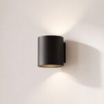
Cylindrical double-beam wall light, 4 colours
See also

Mood Lighting: The Three Settings That Really Create It, Room by Room

How to Change Spotlight Bulbs, With or Without a Clip

Conservatory Lighting: Which Lights Cope With the Heat, the Glass and the Dark
