

Table of Contents
What colour goes with green? The safe partners are pale wood, off-white, beige and greige, and they suit every shade. For character, add terracotta, dusty pink, navy, mustard or black. For the light itself, stay between 2,700 and 3,000 K and pick a bulb with a high colour rendering index.
Green has moved onto walls, kitchen units and sofas across Ireland, and it raises a question other colours raise less often: which green? There is more distance between a pale mint and a bottle green than between two blues. Green also has a habit almost no colour guide mentions: it shifts more than any other colour with the light falling on it, so a pairing that looks right at noon can look dull at eight in the evening. This guide gives the colours that go with green, shade by shade, then the light that keeps them.
Shades of green do not call for the same colours
Green takes up the largest slice of the visible spectrum as far as the eye is concerned, and English has dozens of names for it. Six shades cover almost everything that reaches a wall.
| Shade | Undertone | Safe pairings | Accent | Light |
|---|---|---|---|---|
| Pale mint | Blue, very light | Brilliant white, pearl grey, blond wood | Coral, brass | 3,000 K |
| Sage green | Greyed, a hint of yellow | Off-white, linen, pale oak | Terracotta, dusty pink | 2,700 to 3,000 K |
| Olive green | Yellow, luminous | Sand beige, camel, walnut | Navy, brass | 2,700 K |
| Khaki green | Grey brown, muted | Off-white, greige, tan leather | Mustard, black | 2,700 K, high CRI |
| Bottle green | Cool, very dark | Off-white, pale oak, marble | Brass, dusty pink | 2,700 K, more lumens |
| Emerald green | Saturated, blue | White, black, charcoal grey | Gold, burgundy | 3,000 K, high CRI |
Shade names mean little from one chart to the next. Our reference points, for comparing ranges rather than ordering paint: pale mint #B9D7CE, sage green #A3AE8F, olive green #767A42, khaki green #5E5B3E, bottle green #1E4336, emerald green #0E7A5F.

Two families emerge. The greyed, low saturation greens, pale mint, sage and khaki, behave like coloured neutrals: they accept almost anything but never impose their own tone, so the light decides how they look. The deep or saturated greens, olive, bottle and emerald, hold their colour under any bulb, but they swallow light and need a well lit room. Sage, the most common of the six, has a guide of its own, what colour goes with sage green.
What colour goes with green: the safe pairings
Three families work with all six shades. Put them down first, on the large surfaces.
Wood, the default partner
Wood and green come from the same place, and the eye accepts the pairing without thinking. The useful rule is the tone of the wood, not the species. Pale wood, limed oak, ash or birch, freshens a dark green; mid or dark wood, walnut, teak or smoked oak, warms a greyed green and gives it weight. The trap is red wood, varnished mahogany or cherry, whose orange undertone fights a blue green such as emerald. A wooden pendant light carries that link on without adding a colour.
Off-white and beige, but not just any
A brilliant white, which is slightly blue, makes greyed greens look greyer by contrast; an off-white, cream or eggshell, leaves them green. Use it on the ceiling, the woodwork and the bed linen: it also bounces the most light back into a green room. Sand beige, linen and camel do the same in a warmer register, unbeatable next to an olive or a khaki green.
Greige and warm greys
Greige, halfway between grey and beige, is the most practical neutral in a green home: enough warmth not to kill the colour, enough grey to calm it. Choose a warm grey or a pearl grey rather than a blue grey, which chills the room. The same trade-offs apply when grey dominates, in our guide to what colour goes with grey.
Bold contrasts: terracotta, pink, navy, mustard and black
Once the base is down, the accent gives the scheme its character. Work to roughly 60 per cent background, 30 per cent secondary and 10 per cent accent: over a third of a room, an accent becomes a second dominant colour.
- Terracotta is the safest contrast of all: green and an orange red sit opposite each other on the painter’s colour wheel, so each makes the other look stronger. It works with sage, olive and khaki; against a bottle green it becomes a bold statement. Our guide to a terracotta bedroom works through the proportions.
- Dusty pink and old rose soften the same contrast: the most elegant pairing with a pale mint, a light sage or a bottle green.
- Navy deepens without warming. Keep it for the lighter or yellower greens: bottle green and navy side by side read as one dark mass once night falls.
- Mustard yellow wakes up the muted greens. The natural ally of khaki and forest green, in small doses.
- Black does not add colour, it draws a line. A thin black edge, a lamp base or a wall light makes a green look crisper. On a pale green it works better than a dark grey, which leaves the result vague.
What colour is complementary to green?
It depends on the model, which matters when you buy paint and bulbs at the same time. On the painter’s colour wheel, behind every paint chart, the complementary of green is red, softened in practice into terracotta, brick or burgundy. In additive mixing, the model for light and screens, it is magenta, which is why a strong pink works beside green under coloured lighting while it looks riskier on a sample board. To make green pop, mute the complementary: terracotta lifts a green without the Christmas effect of a pure red.
Why your green is never the same twice
The shade you see does not belong to the paint: it is the product of what the paint reflects and what the source emits. Green is the most exposed colour of all, for two reasons. It sits in the middle of the visible spectrum, where the eye is most sensitive in daytime vision, around 555 nanometres, so a small dip in a lamp’s spectrum shows on a green wall far more than on a beige one. And green is almost always used in low saturation versions, mixed with grey and yellow, which have too little character of their own to resist the light they are given.

In Ireland this matters more than in most places. Met Eireann puts the national average at 1,100 to 1,600 hours of bright sunshine a year, with May and June the brightest months and December the dullest. Most of the daylight your walls receive is therefore diffuse light from an overcast sky, conventionally represented by the standard illuminant D65 at around 6,500 K, and a north facing room gets a blue skylight cooler still. In the evening a warm white LED drops to 2,700 K, a wider gap than between two neighbouring shades on a chart.
In a north facing room, light stays cool and steady all day, so greyed greens look greyer and bluer than they did in the shop: choose a shade leaning clearly towards yellow, and bring the warmth back in the evening at 2,700 K. In a south or west facing room the opposite happens: yellow greens such as olive and khaki drift towards gold under warm late afternoon light, and a cooler green holds up better. That leaves the moment nobody tests before painting, the evening, under the lamps. Our advice: paint a test patch at least 50 cm square and look at it three times, morning, afternoon, then with your bulbs on.
The effect has a name: metamerism. Two surfaces can look alike under one light and clearly different under another, the usual cause of a bad surprise between a green paint and a green fabric bought in different shops. One quirk works in green’s favour. When light levels fall sharply, the eye’s peak sensitivity moves towards 507 nanometres, towards blue green: the Purkinje effect, described in 1825. In a dim room a green wall keeps its presence better than a red one, which goes flat first.
Which bulb to choose for a green room
Two figures decide, both on the product information sheet of every light source sold in the European Union: the colour temperature, in kelvins, and the colour rendering index, written CRI or Ra.
| Room | Colour temperature | CRI to aim for | Why |
|---|---|---|---|
| Living room, bedroom | 2,700 K | 90 and above | Keeps the green warm and alive in the evening |
| Kitchen, dining room | 3,000 K | 90 and above | A balance between comfort and reading colours |
| Worktop, desk | 4,000 K, task only | 90 and above | Working light, never across the whole room |
| Dark green wall | 2,700 K | 90 and above | Allow for more lumens, the paint absorbs |
Colour temperature works against intuition. On a greyed green, a neutral white of 4,000 K strips the yellow out of the shade and tips it towards grey; a very amber bulb, below 2,400 K, pushes the same green towards khaki. Warm white at 2,700 K in the living room and 3,000 K in working rooms remain the sound settings. One point before you order: the bayonet cap, B22, is still the standard fitting on most Irish ceiling roses, while high CRI bulbs are easier to find in E27.
CRI, and the leaf green trap
The colour rendering index compares the colours a lamp produces with those of a reference source. The detail that changes everything: the general index averages eight test colour samples only, numbered R1 to R8, all low in saturation. The samples added later stay outside the calculation, and one of them, R14, is precisely a leaf green, a mid olive green. Two bulbs both labelled CRI 80 can therefore render an olive green wall very differently, with nothing on the packaging to warn you. That is why we recommend a CRI of at least 90 in a green room, and 95 if the shade is greyed: the difference is visible to the naked eye on a sage or a khaki. An old fluorescent batten in a utility room is the worst case of all, because its colour drifts as the tube ages: if it blinks instead of lighting, start with the fluorescent light starter. For the rest of what to read on the box, see our guide to LED bulbs.
More lumens on the dark greens
A wall painted bottle green or forest green sends back only a small part of the light it receives, where an off-white sends back most of it. A dark green room therefore needs more lumens than a pale one, and above all several sources rather than one ceiling fitting: see how many lumens do I need. If that means new fixed wiring, it is work for a Registered Electrician under the national rules for electrical installations, I.S. 10101, and Safe Electric is the register to check.
Metals, materials and lights that go with green
Light fittings are often the only metal on show in a room, and that is where the scheme is won or lost.
- Brass and gold are green’s historic partners: their yellow undertone answers the yellow in the colour and warms the greyed greens. A brass wall light often takes a green wall from flat to welcoming.
- Matt black draws. It gives a pale green an outline and avoids the pastel effect, but darkens a dark green.
- Glazed ceramic brings gloss where paint is matt. A green ceramic fitting on an off-white wall reverses the composition: the colour moves into the object and the room feels bigger.
- Opal glass spreads a soft light with no hot spot, for green rooms where you want atmosphere.
- Rattan and natural fibres carry on the botanical theme, but tint the light yellow as it passes through: keep them for ambient light.

When the walls stay neutral, the green can come from the fitting instead. A green pendant light over a table, or a pair of green wall lights either side of a bed, brings the colour in without opening a tin of paint.
What colour does not go with green
Four pairings keep turning up in rooms that do not work.
- Two greens with opposing undertones. A blue green and a yellow green pull against each other. A tonal scheme works if the greens share an undertone.
- Bright red over a large area. Green’s complementary, in equal measure, tires the eye and brings Christmas to mind. It holds only as a muted accent.
- Strong purple beside a cool green. Same depth, same intensity, so nothing in the room takes the lead.
The fourth, brilliant white next to a greyed green, is a question of light rather than taste: the blue contrast greys the colour, especially in a north facing room. Add a mistake which is not a colour at all, a single light in the middle of the ceiling. Greens absorb a lot and need several low sources: a pendant, one or two wall lights washing the wall and a lamp beside the seating transform a green room more reliably than changing the shade.
Frequently asked questions about green colour combinations
Which colour looks best with green?
Pale wood and off-white, in every case. They lighten a dark green and leave a greyed green green, instead of pulling it towards grey the way a brilliant white does. If you want a colour rather than a neutral, terracotta is safest with sage, olive and khaki, dusty pink with pale mint and bottle green.
What is the best colour combination with green?
Olive green with sand beige, pale oak and a brass light fitting works in the widest range of rooms. For something cooler, try bottle green with off-white, marble and dusty pink. Keep to roughly 60 per cent background, 30 per cent secondary colour and 10 per cent accent.
What colour is complementary to green?
On the painter’s colour wheel, the one behind paint charts, it is red, used in decorating as terracotta, brick or burgundy. In additive mixing, the model for light and screens, it is magenta, which is why a strong pink sits so well beside green under coloured lighting.
What colour makes green pop the most?
A muted version of its complementary: terracotta, burnt orange or rust. Pure red over a large area is too violent and reads as Christmas. Brass and gold do the same on a smaller scale, because their yellow undertone picks up the yellow inside most greens.
What colour goes with dark green?
Off-white, pale oak and marble for the base, brass or gold on the metal, dusty pink or burgundy as an accent. Avoid navy, which merges into a single dark mass in the evening. A dark green wall absorbs a lot of light, so allow for more lumens and several sources.
What colours go with a green sofa?
Treat the sofa as the dominant colour and keep the walls neutral: off-white, greige or sand beige. Add cushions in terracotta, dusty pink or mustard, a pale oak coffee table and a brass floor lamp. A bulb of 2,700 K with a CRI of 90 or more keeps the upholstery the colour you bought.
Sources
- Colour rendering index and the test colour samples, including R14, leaf green, excluded from the general index Ra. International Commission on Illumination
- Standard illuminant D65, the conventional representation of daylight, around 6,500 K. International Commission on Illumination
- Sunshine in Ireland: 1,100 to 1,600 hours a year, May and June the sunniest months, December the dullest. Met Eireann, the Irish Meteorological Service
- Energy labelling of light sources, product information sheet (colour temperature and colour rendering index). European Union
- Metamerism, and the Purkinje effect described in 1825 (peak eye sensitivity near 555 nm in daylight, 507 nm in dim light). Wikipedia
Related products
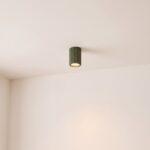
Modern green grooved aluminium tubular ceiling light

Modular design pendant light in olive green and beige
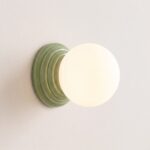
Design ceramic enamel wall light with glass globe
See also

Sloped Ceiling Lighting: What to Fit Under an Attic Slope

Mood Lighting: The Three Settings That Really Create It, Room by Room

How to Change Spotlight Bulbs, With or Without a Clip
