

Table of Contents
Warm white, 2,700 to 3,000 K, belongs in the rooms where you unwind: living room, bedroom, dining room. Neutral white, around 4,000 K, belongs wherever you look closely at something: a worktop, a bathroom mirror, a desk. Cool white, above 5,300 K, earns its place only in a garage, a workshop or a utility room.
The question comes up every time a bulb goes, and the short answer never holds for long: once the fitting is up, the whole room changes face. Pale oak turns honey, a soft grey drifts blue, an oatmeal linen goes cold. So this guide starts from the light itself: what each tint does to your walls, the temperature to pick room by room, then the one call worth thinking about, 3,000 K against 4,000 K.
Warm white, neutral white and cool white: where the lines fall
Colour temperature describes the tint of a white light. It is given in kelvins (K), a unit of temperature, because it names the temperature an ideal body would have to reach to glow that colour. Hence the thing that throws everyone in the bulb aisle. The lower the number, the warmer the light. A candle sits near 1,900 K, an old filament bulb near 2,700 K, an overcast midday sky near 6,500 K.
The three families are not marketing labels. Lighting engineers separate them with two thresholds.

- Warm white, below 3,300 K. Plenty of red and orange, little blue. The rooms you live in.
- Intermediate or neutral white, 3,300 to 5,300 K. A balanced spectrum, whites stay white. The rooms you work in.
- Cool white, or daylight, above 5,300 K. Blue dominates. The places you keep the car and the tools.
In the shops the values on offer come down to five: 2,700, 3,000, 4,000, 5,000 and 6,500 K. The rest is packaging. The figure is printed on the box of every bulb sold in the European Union, beside the lumens and the watts, and on the datasheet of any integrated LED fitting. Our guide to LED bulbs shows you where to find it. One thing to settle straight away: the kelvins tell you nothing about how much light you get, nor how faithfully colours come out. Lumens say how much, kelvins say what tint, the colour rendering index says how truthfully.
What the tint does to your walls, timber, fabric and metal
This is the part the comparison tables skip, and the part that decides whether you like the room. A surface has no colour of its own: it gives back what the light sends it.


Same room, same fitting, same framing in both photographs. Only the tint changes. Here is what moves, material by material.
Timber
Under 2,700 K, pale oak and beech pull hard towards honey and walnut gains red. At 4,000 K the oak goes back to its greyed beige, the walnut to a cooler brown. A pale floor you thought was too yellow on the day it went down is usually the bulb’s doing, not the finish.
Whites and beiges
Off-white, oatmeal and greige should never be judged under a warm light: they all drift towards cream. That is why a colour picked in a shop, under tubes at 4,000 K, disappoints on a living room wall lit at 2,700 K. Hold the card up in the room itself, in the evening, under the fitting that is staying.
Greens and blues
The big losers under warm light. An LED at 2,700 K holds little blue, so a sage green goes grey, an olive darkens and a teal loses its depth. Our guide to what colour goes with green works through that instability, which owes as much to the colour rendering index as to the kelvins.
Metal and skin
Brass, gold and copper come alive under a warm light and go flat above 4,000 K, where they take on a pale, slightly dirty yellow. Chrome, nickel and brushed aluminium need neutral light to stay crisp. Skin follows the brass: a complexion is flattered between 2,700 and 3,000 K and greys above 5,000 K. That is the deciding argument at a bathroom mirror.
Warm white or cool white, room by room
Here is our decision table. The last column names the mistake we see most often in what customers tell us.
| Room | Our pick | Why | The trap |
|---|---|---|---|
| Living room | 2,700 K | Evenings and downtime, close to the old filament light | Going to 4,000 K to see better: what is missing is lumens, not kelvins |
| Dining room | 2,700 to 3,000 K | Flatters food, timber and the faces round the table | A warm pendant and neutral spotlights in the same open room |
| Bedroom | 2,700 K | Light low in blue before sleep | A cool reading light at the bedside that cancels out the rest |
| Kitchen worktop | 4,000 K | You chop, you read labels, you judge whether meat is done | Lighting the whole volume at 4,000 K when the kitchen opens onto the living area |
| Bathroom mirror | 3,000 to 4,000 K | Shaving and make-up need a truthful white, one source each side | A single ceiling light that lights the top of the face and digs out the eye sockets |
| Home office | 4,000 K | Long reading, a screen, paperwork | Keeping 4,000 K after 8 p.m. when the office doubles as a spare room |
| Wardrobe, press | 3,000 to 4,000 K | Telling navy from black, chocolate from bottle green | A colour rendering index too low for the kelvins to matter |
| Hall, landing | 3,000 K | A crossing point between the front door and the living rooms | A hall cooler than the rooms it serves: the house looks cut in two |
| Stairs | 3,000 K | Reading the nosings without dazzling anyone coming down | A sensor that fires up 6,500 K in the middle of the night |
| Garage, workshop, utility | 5,000 to 6,500 K | Precision work, sorting, ironing, checking something is clean | Carrying that cool white through to a pantry that opens off the kitchen |
| Outside, patio | 2,700 to 3,000 K | Comfort, and less disturbance to night-flying insects | A 6,500 K security floodlight aimed at the front of the house |
Three rooms have a guide of their own, because the temperature is only part of the answer: the kitchen, where each zone wants its own setting, the wardrobe, where the colour rendering index counts for more than the kelvins, and the hall: see our guide to hallway paint colours.
Living room, bedroom and dining room: why warm white stays
In the rooms you live in, light has two jobs: making the space readable, and seeing the day out. The second explains the consensus around 2,700 K.
Light rich in blue, which is what a cool white is, is the light that holds back melatonin in the evening. A controlled trial in the Proceedings of the National Academy of Sciences compared reading on a backlit e-reader with reading on paper before bed: the screen delayed melatonin release, shifted the body clock by more than an hour and a half and left people less alert the next morning (doi.org/10.1073/pnas.1418490112). The European Commission’s scientific committee on health and emerging risks is more cautious: its 2018 opinion found no evidence of direct harm from LEDs in normal use, but some evidence that light late in the evening, lamps and screens included, can disturb the body clock, without it being clear yet whether that harms health. Keeping warm white for the evening is our advice, a sensible default rather than a medical rule.
- The ceiling light sets the tone. It is the strongest and most visible source: if it is neutral white, warm table lamps rescue nothing.
- Height changes the feel. Under a high ceiling, neutral white pushes the room towards hotel lobby rather than sitting room.
- A bedroom is treated as a whole. Ceiling light, reading lights and night light all at 2,700 K, or the effect goes the moment you switch on the wrong one.
Our advice: torn between 2,700 and 3,000 K in a sitting room, look at your walls. On white or very pale walls, 3,000 K avoids the yellowed look. On beige, terracotta or green, 2,700 K gives the depth that neutral white rubs out. Through an Irish winter, when the room sees no daylight between four in the afternoon and eight in the morning, that depth is what it lives on. It is also why 2,700 K is the default throughout our guide to urban jungle interior design.
Kitchen, bathroom and home office: when neutral white earns its place
Neutral white is not a comfort light, it is a precision light. So you give it the surfaces, not the volumes.
The kitchen, zone by zone
A worktop at 4,000 K shows the true colour of a piece of meat, a sauce or a salad, and cuts the risk of catching a finger. The volume of the room is better at 3,000 K, especially where the kitchen opens onto the living area. Light the worktop and the splashback in neutral, with strips or under-cupboard spots, and everything else in warm. If the ceiling point is not over the worktop or the island, our guide to the off centre pendant light brings the light there without new wiring.
The bathroom and the mirror
At the mirror, 3,000 or 4,000 K, with two points of light either side of the face rather than one overhead. Above 5,000 K make-up put on in front of that mirror reads too strong outdoors. The rest matters as much as the kelvins: an IP rating suited to the zone, and a colour rendering index of at least 90. Our guide to bathroom lighting sets out the zones, and new wiring in a bathroom is work for a Registered Electrical Contractor under the national rules.
The home office
For paperwork or screen work, 4,000 K is right during the day. The standard on indoor work places asks for 500 lux on a desk used for writing, typing and reading: it fixes the quantity of light, not the tint. For fidelity, aim for a colour rendering index of at least 80, the floor that EU ecodesign rules set for most bulbs sold here. If the office doubles as a spare room, add a second warm source for the evening, rather than a lukewarm 3,500 K that suits neither.
3,000 K or 4,000 K: the only call that really matters
Between 2,700 and 6,500 K the gap is obvious. Between 3,000 and 4,000 K it is subtle, and that is where most purchases are decided. Three received ideas first.
“Cool white gives more light”
Not at equal output. Light is measured in lumens, not kelvins: 800 lumens at 3,000 K and 800 lumens at 4,000 K light a room equally. A cool light often looks brighter, because the eye is more sensitive to short wavelengths at low levels, but the meter does not move. If a room is short of light, revisit the lumens: our lumens to watts chart gives the equivalents.
“The neutral version always gives more lumens”
Not always. On the 78 cm ring chandelier in our selection, the datasheet quotes 4,231 lumens at 3,000 K and 3,865 lumens at 4,000 K for the same 32 W: the warm version is the brighter one, by 9 per cent. On other models it goes the other way. Read the lumens quoted for the exact version you order.
“Neutral white renders colour better”
That is the colour rendering index talking, not the tint. The two are independent: an LED at 2,700 K with an index of 95 shows a fabric more truthfully than one at 4,000 K with an index of 80. For a sitting room, then, look for a high index in warm white rather than switching to neutral: cooler light is no substitute for better colour rendering.
Which leaves the criterion that actually decides things: where the choice is made.
- On a fitting with an integrated LED, the temperature is fixed in the factory. You choose it when you order, like a finish, and it never changes.
- On a fitting that takes a bulb (B22, E27, E14, G9 or GU10), the bulb decides. You can change your mind for a few euro, and try two tints before settling.
- On a tunable white source, the temperature is set from an app or a remote: the answer for an office that doubles as a spare room. Our guide to smart bulbs explains what “tunable white” and “white ambiance” cover.
Our advice: the rule that pays is not picking a value, it is being consistent. One temperature per room, two at most in an open-plan space, with a clean boundary: the worktop in neutral, everything else in warm. Two different whites side by side show up instantly on a pale wall, and neither looks right. The integrated LED models sold in a choice of 3,000 or 4,000 K are in our LED lights range.
Warm white and cool white: frequently asked questions
What looks better, cool white or warm white?
It depends on what the room is for. Warm white at 2,700 to 3,000 K looks better in a living room, a bedroom or a dining room, because it flatters timber, skin and food. Cool or neutral white looks better over a worktop, at a mirror or on a desk, where you need to see a colour truthfully. What always looks wrong is two different whites side by side on the same pale wall.
Is warm white good for eyes?
Warm white is easier to live with in the evening, because it carries less blue and interferes less with sleep. But comfort depends far more on three other things: enough lumens for the room, no glare from a bare lamp in your line of sight, and no visible flicker. A warm white too dim for the task tires you more than a well sized neutral white.
Is cool white the same as natural white?
No, and the labels are not consistent. Natural white, neutral white and sometimes daylight white usually mean 4,000 K, in the middle of the scale. Cool white proper sits above 5,300 K and is normally sold at 6,500 K. If the box gives a name and no figure, go by the kelvin value printed beside the lumens, which is mandatory in the European Union.
What is the difference between 3,000 K and 4,000 K?
3,000 K is a warm white, still slightly golden, which flatters timber, beiges and faces. 4,000 K is a neutral white with no cast, which separates dark shades better and shows the true colour of food or fabric. The gap shows up most on pale walls and on metal. We keep 3,000 K where you live and save 4,000 K for work surfaces.
Which gives more light, warm white or cool white?
Neither: light is measured in lumens, not kelvins. At 800 lumens, a bulb at 3,000 K and a bulb at 4,000 K light a room equally. Cool light often seems brighter because the eye is more sensitive to short wavelengths at low levels, but a light meter reads the same value. If a room is short of light, add lumens.
Can you mix warm white and cool white in the same room?
Two different whites side by side show up at once on a pale wall, and neither looks right. The exception that works is an open-plan space with a clean, functional boundary: the kitchen worktop in neutral white, everything else in warm white. In a closed room, keep one temperature across every source, ceiling light included.
Sources
- Chang AM, Aeschbach D, Duffy JF, Czeisler CA. Evening use of light-emitting eReaders negatively affects sleep, circadian timing, and next-morning alertness. PNAS, 2015, 112(4), 1232 to 1237
- I.S. EN 12464-1, Light and lighting, lighting of work places, part 1, indoor work places: illuminance by task. National Standards Authority of Ireland
- Opinion on potential risks to human health of light emitting diodes, blue light and domestic lighting. Scientific Committee on Health, Environmental and Emerging Risks, European Commission
- Ecodesign requirements for light sources: mandatory product information, correlated colour temperature and colour rendering index. European Union
- I.S. 10101, National Rules for Electrical Installations, and the register of Registered Electrical Contractors. Safe Electric, NSAI
Related products
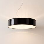
Drum pendant light, 45 cm, white or black

LED ring chandelier, 78 cm, 4 finishes
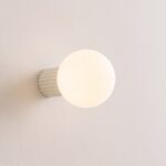
Opal glass ball wall light with fluted aluminium base
See also

Mood Lighting: The Three Settings That Really Create It, Room by Room

How to Change Spotlight Bulbs, With or Without a Clip

Conservatory Lighting: Which Lights Cope With the Heat, the Glass and the Dark
