
Table of Contents
Calming colours have no hue in common: blue-grey, sage, greige, linen and dusty pink all share a low saturation and a mid to high lightness. The claim that a paint slows your heart rate is thin. What is well documented is the evening light that lets them work: warm, around 2,700 K, low, and spread over several small sources.
Search for calming colours and the same list comes back from page to page: pale blue, sage green, lavender, beige, each sold as soothing, with a promise of a slower pulse and a quieter mind, and never a word about the bulb that will light it. That is a problem, because a wall has no colour of its own: it sends back whatever light you give it. A sage chosen on a card under the bright tubes of a paint shop is not the sage you will see at nine in the evening under a warm white LED. Through an Irish winter, when the lights go on in the late afternoon, that evening version is the one your home lives with.
This guide separates what research has actually measured about colour and mood, with its limits, from what can be put into figures: how much light the room gets, the contrast between its surfaces and the tint of the light in the evening. That, more than the colour card, is where a calm room is won or lost.
What the research on calming colours really shows
The reference study is still the one Patricia Valdez and Albert Mehrabian published in 1994. Participants rated how they felt in front of colour chips from the Munsell system, in which hue, saturation and lightness can be varied one at a time. The results fit in two equations: pleasure rose mainly with lightness and a little with saturation, while arousal rose with saturation and fell with lightness (Valdez and Mehrabian, 1994). Put plainly, a light, soft colour is rated pleasant and unstimulating, whatever its hue.
One finding upsets the usual list. Among the hues, green-yellow, blue-green and green were the most arousing in that study, not the most calming, while purple-blue and yellow-red, a soft orange, were the least arousing. Blue, blue-green and green did rank among the most pleasant hues, which is probably where their reputation comes from. Pleasant is not the same thing as calming.
A 2018 study took the question up again with tighter controls. Sixty-two people looked at 30 colours on an LED display, 27 of them chromatic and 3 greys, for 30 seconds each, while their skin conductance and heart rate were recorded. Saturated colours raised arousal, in the ratings and in the skin response alike, and arousal also rose from blue and green towards red. Unlike the 1994 study, brighter colours were rated more arousing, not less. Grey shades produced a brief slowing of the heart rate and coloured ones a brief acceleration, over seconds on a screen (Wilms and Oberfeld, 2018). The two studies disagree on lightness. They agree on saturation, and that is the one factor worth building a room around.
A 2020 survey of 4,598 people in 30 countries found strikingly similar links between emotions and colour words everywhere, with nuances shaped by language and geography (Jonauskaite et al., 2020). Shared associations with colour words are not a physical effect of paint on a wall.
Finally, the main review of the field, in the Annual Review of Psychology, describes it as still at a nascent stage, and says that much more work on real-world settings is needed before firm recommendations can be made (Elliot and Maier, 2014). Here is what that leaves of the claims you will read elsewhere.
| What you read | What was actually measured | What to keep |
|---|---|---|
| Blue lowers your heart rate and blood pressure | Small, short reactions to colours on a screen or a chip, over seconds, not to a wall lived with every day | No basis for a health promise. Pale blue is still a fine choice, for other reasons |
| Green rests the eyes and the mind | In 1994, green and green-yellow were among the most arousing hues measured | It is a greyed green that calms, through its low saturation, not green as a hue |
| Each colour has its own effect on mood | Saturation and lightness explain most of the effect, hue a smaller part | Choose the intensity first, then the hue you like |
| These effects are universal | Very similar associations with colour words from one country to the next, shaped by language and geography | Robust cultural associations, not a biological mechanism |
Our position is simple: we will not tell you that a paint treats anything, because we have found no peer-reviewed study showing it. Three things, on the other hand, can be measured in a room and do change how calm it feels: how much light there is, the contrast between its surfaces and the tint of that light in the evening.
The calming colour palette: low saturation, mid to high lightness
Line up the calming colour ideas that paint ranges publish and you get a cloud of very different hues: sky blue, sage, lavender, linen, taupe, dusty pink, eau de nil. They have no hue in common. What they share is a low saturation and a mid to high lightness.
The benchmark we use, reading the HSV values of a digital colour card: saturation under 25 per cent, brightness between 60 and 85 per cent. Above 25 per cent saturation, a colour becomes a statement colour that asks to be looked at. Below 60 per cent brightness, it swallows light, and the lighting has to make up for it. We stop at 85 rather than going all the way to brilliant white, since the 2018 study found the brightest colours more arousing, not less.

The main families then sort themselves out like this, with what each one asks of the light.
| Family | Examples | Saturation and brightness | What it asks of the light |
|---|---|---|---|
| Greyed blues | Blue-grey, greyed sky blue, pale denim | 10 to 20 %, 70 to 85 % | The most fragile in the evening: under 2,700 K it slides towards a flat grey |
| Greyed greens | Sage, almond, eau de nil | 12 to 22 %, 65 to 80 % | Under 2,700 K a sage loses some green and goes grey; the yellower sages hold up best |
| Soft violets | Greyed lavender, dusty lilac | 8 to 18 %, 70 to 85 % | Drifts towards a pinkish beige under warm light |
| Warm neutrals | Linen, beige, greige, light taupe | 8 to 18 %, 60 to 85 % | The most stable: it gains depth in the evening instead of falling apart |
| Pale earth tones | Dusty pink, pinkish sand, pale clay | 12 to 25 %, 70 to 85 % | Flattered by warm light, flattened by neutral white |
Two practical points. First, the finish counts as much as the colour. A matt paint shows no reflection of the lamps; a satin sends back a blurred image of every source and adds contrast just where you were trying to remove it. Keep satin for the halls and kitchens that need wiping, and matt for the rooms you rest in. Second, a calming colour never works alone: a soft background takes stronger touches in small areas, as our guide to what colour goes with sage green shows shade by shade. For the warm neutral that copes best with Irish evenings, see our guide to greige colour.
How much light calming colours send back
A soft colour changes the amount of light in a room, not only its mood. Paint ranges sold in Ireland print a light reflectance value, or LRV, beside each colour: the share of the light a wall sends back, on a scale of 0 to 100. A wall at 70 returns 70 per cent of what it receives, a wall at 20 only a fifth. Our guide to hallway paint colours ranks every family by reflectance, in the room where it matters most. Here are the figures for the calm palette, and the extra lumens our rule of thumb adds for each.
| Wall colour | Light reflectance value | Lumens to fit, compared with pale walls |
|---|---|---|
| Warm off-white, linen | 70 to 80 | No change |
| Greige, pink-leaning beige | 55 to 65 | Little or no change |
| Pale sage green | About 50 | About 20 % more |
| Warm grey | About 50 | About 20 % more |
| Light terracotta, greyed apricot | About 40 | About 20 % more |
| Blues | 20 to 50 | 20 % more, up to 40 or 50 % for the deepest |
| Forest green, navy | 10 to 25 | 40 to 50 % more |
Take a 12 m² bedroom. Our house rule, worked through in our guide to how many lumens you need, multiplies the floor area by the light level and doubles the result: about 2,400 lumens for everyday light at 100 lux with pale walls. With pale sage walls, add 20 per cent, about 2,900 lumens. With navy or forest green, the dark colours often sold as cocooning, allow 3,400 to 3,600. The same proportions apply to the low evening setting: around 360 lumens for 15 lux on pale walls, about 430 on sage, 500 to 540 on navy.
That is the hidden cost of a deep calming colour. The answer is not a stronger bulb, which brings back the glare you were trying to escape, but one more source placed elsewhere in the room.
Why evening light decides whether a colour stays calm
Here the figures exist and are agreed. In 2022, an international group of researchers in circadian photometry published consensus recommendations for indoor light for healthy adults, expressed in melanopic lux: light weighted by the sensitivity of the retinal cells that set the body clock, a quantity defined in an international standard of the International Commission on Illumination (Brown et al., 2022).

Three limits, measured at eye level on a vertical plane about 1.2 m off the floor. During the day, at least 250 melanopic lux. In the three hours before bed, no more than 10. In the bedroom at night, no more than 1. The same paper notes that a screen on its own in the dark can give more than 60, which puts a good deal of the debate about wall colours into perspective.
The good news is that the evening limit does not mean sitting in the dark. The authors note that evening light in homes is commonly around 30 lux, and that many ordinary warm white LEDs, at 2,700 to 3,000 K, have a melanopic content low enough to stay within the limit at that level. The low, warm settings described in our guide to mood lighting, around 20 lux in a living room and 15 in a bedroom, sit comfortably below that.
Three consequences follow for a calming palette.
Warm evening light flatters the warm palette, not the cool one. This is the paradox of the whole subject. The families most often recommended as calming are the cool ones, and they are the ones that a 2,700 K light treats worst: a warm white holds little blue, so a blue-grey slides towards a flat grey, a lavender towards pinkish beige, and a sage loses its green and greys. Warm neutrals and pale earth tones hold up. If you live in the room mostly in the evening, the sensible choice is not the magazine blue but a linen, a greige or a pale clay. Our comparison of warm white vs cool white shows what each colour temperature does to walls, timber and fabric, room by room.
Colour fidelity is a real trade-off. The 2022 authors note that light sources engineered to give out as little melanopic light as possible are likely to cost you some colour discrimination. You cannot protect the evening to the extreme and still see your sage exactly as on the card; in a green or blue room, aim for a colour rendering index of 90.
Dimming one ceiling light is not the same as calm light. Turning a single overhead fitting down cuts the lumens but leaves the bright point above your head and the flat light below it. The calmer move is to switch it off and switch on two or three small, low sources instead.
Calming bedroom colours: light first, then paint
For sleep, the only lever with real evidence behind it is light. The 2022 recommendations ask for a bedroom as dark as possible at night, under 1 melanopic lux at the eye, and note that even low levels, above about 3, have been linked with poorer sleep in large cohort studies. No paint produces that effect, and none prevents it. Before you choose a colour, deal with the curtains or blinds, the night light and the little standby LEDs on chargers and televisions.
Once that is settled, colour has its say, on two conditions.
The first is quantity. A deep shade on bedroom walls absorbs much of the light available, and a room that looked soft on the sample card turns dull once painted. As above, the answer is an extra source, not a brighter one.
The second is placement. In a bedroom, the useful light is the light that falls on a book or a bedside table, not the light that fills the space. A reading light either side of the bed, its beam aimed down at the page, creates exactly that: the book is lit, your field of view stays dim and the evening limit is kept without effort. That is how our white or black steel bedside wall light works: a narrow 15 x 5 cm back plate and a spot 6 cm across that only lights downwards, with a GU10 LED bulb of up to 10 W, not included. Our reading wall lights follow the same idea with adjustable heads, and our guide to reading lights for bed shows how to find the right height. The ceiling light stays for tidying and making the bed, on its own switch.
Adding a light point by the bed is electrical work under I.S. 10101, the National Rules for Electrical Installations, for a Registered Electrical Contractor listed with Safe Electric.
As for the colour itself, take one you like in the low saturation zone, knowing it will mostly be seen under warm, low light. A greyed sage reads almost as a warm grey; a linen turns golden. Our advice: paint a test patch at least 50 cm square on the wall behind the bed and look at it at night, with only the bedside lights on and the bulbs you will actually use. If you are set on a blue, that test matters more than any other.
Calming colours for a living room: a quiet background, small accents
The living room is used by day and in the evening, and the two do not ask for the same thing. By day, the recommendations push the other way, towards at least 250 melanopic lux at eye level. A sitting room kept deliberately dim to look restful, blinds half down and deep colours on every wall, runs against what is known. Keep the daylight, and save the half-light for the evening.
In the evening, the recipe is about distribution rather than the colour card. A low saturation background on the large surfaces, three to five small, low sources that you switch on separately, and contrast kept for small areas: a terracotta cushion, a navy throw, a dark timber. In design terms, the calm comes from the background and the interest from the accents. A room that is beige from floor to ceiling does not feel calm, just flat.
For the main light over a coffee table or a reading corner, choose a large glowing surface over a decorative fitting with visible bulbs. Our beige fabric drum pendant is 40 cm across: the fabric spreads the light of a single E27 bulb over the whole shade and glows softly, while the open underside sends most of the light down onto the table. It takes an E27 LED bulb of up to 15 W, not included, not the B22 bayonet of many Irish fittings. Our range of lampshade pendant lights runs to 64 models, most of them in fabric or natural fibre.

One last point, often overlooked: the fitting is part of the palette. A wall light with a beige or sage base disappears into a wall of the same family; the same light in gloss black makes a dark spot that the eye keeps finding. In a room you want calm, choose the finish of the fitting within the range of the wall, and keep the contrast for the objects you want people to look at.
Calming colours: frequently asked questions
What is the most calming colour?
No single hue wins. The research points to intensity rather than hue: colours with a low saturation and a mid to high lightness are rated pleasant and unstimulating, whether blue-grey, sage, greige or dusty pink. In the 1994 reference study, purple-blue was among the least arousing hues and green among the most. Choose a soft version of a hue you like, and light it warm in the evening.
What is the most relaxing colour for a bedroom?
Any shade under about 25 per cent saturation, in a matt finish, that still looks right under warm light at night. Linen, greige, light taupe and pale clay are the safest, because they hold up under a 2,700 K bulb. Blue-greys and lavenders go flat under warm light, so test them in the evening first. For sleep itself, a dark room counts for more than any colour.
Is grey a calm colour?
A warm grey can be. Grey has no saturation at all, which keeps it quiet, and in a 2018 study grey shades even produced a brief slowing of the heart rate, measured over seconds on a screen. In a room the risk is flatness: under warm evening light a blue-leaning grey turns dull, while a grey with a beige undertone keeps some warmth. Add timber, linen or one warmer accent.
What colours help with anxiety or ADHD?
No wall colour has been shown to treat anxiety or ADHD, and the main review of colour research describes the field as still at a nascent stage. What you can control is the room: soft, low saturation colours, little contrast between the brightest and darkest surfaces, warm and low light in the evening and a dark bedroom at night. If anxiety or attention problems affect daily life, talk to your GP.
How do I make my bedroom more calming?
Start with the light, then the paint. Make the room dark at night with good curtains or blinds and no standby LEDs, use warm bulbs around 2,700 K, switch the ceiling light off in the evening and read by a light aimed at the page. Then choose a soft, matt wall colour, keep strong colours to small accents and test the paint at night, under the bedside lights you actually use.
What colours make a room feel stressful?
Highly saturated colours over large areas, strong contrast between very bright and very dark surfaces, and bare, bright points of light in your field of view. In both studies cited here, saturation was the factor that raised arousal most consistently. A bright red or a vivid yellow is fine on a cushion or a door; on four walls, under a bare bulb, it keeps the eye working all evening.
Sources
- Valdez P. and Mehrabian A., Effects of color on emotions, Journal of Experimental Psychology: General, 1994, vol. 123, no. 4, pp. 394 to 409. American Psychological Association
- Wilms L. and Oberfeld D., Color and emotion: effects of hue, saturation, and brightness, Psychological Research, 2018, vol. 82, no. 5, pp. 896 to 914. Springer
- Jonauskaite D. et al., Universal patterns in color-emotion associations are further shaped by linguistic and geographic proximity, Psychological Science, 2020, vol. 31, no. 10, pp. 1245 to 1260. Association for Psychological Science
- Elliot A. J. and Maier M. A., Color psychology: effects of perceiving color on psychological functioning in humans, Annual Review of Psychology, 2014, vol. 65, pp. 95 to 120. Annual Reviews
- Brown T. M. et al., Recommendations for daytime, evening, and nighttime indoor light exposure to best support physiology, sleep, and wakefulness in healthy adults, PLOS Biology, 2022, vol. 20, no. 3, e3001571 (melanopic equivalent daylight illuminance as defined in CIE S 026:2018). Public Library of Science
- Reflectance factors of common interior surfaces: paints, woods, wallpapers and building materials. Architecture et Climat, Énergie Plus, Université catholique de Louvain
Related products
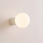
Opal glass ball wall light with fluted aluminium base
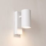
White or black steel bedside wall light
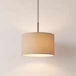
Beige fabric drum pendant light, timeless design
See also

Can You Put a 60 W Bulb in a 40 W Lamp? What the Limit Really Protects

Calming Colours: The Palette, and the Evening Light It Depends On

Colour Rendering Index: The Number That Decides Whether Your Colours Look True
