

Table of Contents
What colour goes with grey? Almost any colour, once you know its undertone. A cool, bluish grey pairs with crisp white, blue, blush pink and black. A warm grey that leans towards brown prefers cream, beige, wood, mustard and terracotta. Brass light fittings and a warm white bulb around 2,700 K do the rest.
Grey has been the safe neutral in Irish homes for years: grey sofas, grey kitchen units, anthracite front doors. It is the easiest colour to buy and one of the hardest to get right. On the paint chart it looks calm and elegant; as grey walls all round a room, it can look cold, flat or even a little dirty. Two things explain the gap: the undertone of your grey and the light that falls on it. No grey is perfectly neutral, and grey takes on the colour of its lighting more than any other shade. In December the sun sets around four o’clock in Dublin, so for much of the year your bulbs, not the daylight, decide how your grey looks. This guide helps you identify your grey first, then choose the colours that go with it, the metal of your light fittings and the bulb that stops it looking dull, room by room.
Warm grey or cool grey? Find your undertone first
Every grey is made of black and white, but almost no grey paint, fabric or tile is a pure mix of the two. It holds a hint of blue, green, yellow or brown, called its undertone, and that undertone decides which colours suit it.
- A cool grey leans towards blue, sometimes green or violet. It gives a crisp, mineral, contemporary feel. It calms a very sunny room but can chill a dark one.
- A warm grey leans towards yellow, beige or brown. It is softer and more enveloping. When brown clearly takes over, you leave grey behind for taupe colour, a greyish brown with its own rules and its own partners.
- A true neutral grey, with no visible undertone, is rare. It is also the grey that changes most from one light to another.
To find out which side your grey is on, hold the sample against a sheet of white printer paper in daylight. Next to the white, the undertone shows at once: bluish, greenish, yellowish or brown. Then hold it beside a grey you know is cool, such as a concrete grey: the difference jumps out. Here are six reference shades we use to place a grey:
- Cool greys: pearl grey #C8CCD0, concrete grey #9DA2A6, anthracite grey #383E42.
- Warm greys: linen grey #D5D0C7, pebble grey #A69F94, graphite #4A4642.

What colour goes with light grey?
A light grey makes a room feel bigger and bounces light well, but it quickly lacks depth. It needs colours stronger than itself: a blush or dusty pink for softness, a navy or forest green for depth, a mustard yellow for energy. Pearl grey, which is cool, likes pure white and blues; linen grey, which is warm, likes beige, natural linen and pale wood. Avoid surrounding it only with brilliant white and other pale greys: the whole room ends up looking washed out.
What colour goes with dark grey and anthracite?
Anthracite grey, the RAL 7016 of so many window frames and composite front doors, absorbs a lot of light. It needs pale colours that let it breathe, such as off-white, cream, beige or pearl grey, and materials that catch the light: brass, gold, glass, velvet. On an anthracite wall, one colour accent is enough: a cognac leather armchair, an ochre cushion or a large plant. It is also the grey that shows off a gold light fitting best, the metal glowing against it like a jewel in its case.
What colours go with grey? The pairings that work
Grey accepts a lot of colours, but not all in the same way. This table sums up the safest pairings, with the grey that suits each one and the light fitting finish that completes it.
| Colour to pair | What it brings | The grey that suits it | Light fitting finish |
|---|---|---|---|
| Off-white, cream, beige | Light, softness | All, warm greys above all | Brass, wood |
| Pale wood | Warmth, texture | All | Black, brass |
| Mustard, ochre | Energy, cheer | Mid grey or anthracite | Gold, black |
| Blush, dusty pink | Softness, elegance | Light grey, cool or warm | Gold, brass |
| Duck egg to navy blue | Calm, depth | Cool greys | Brass, chrome |
| Sage, olive, forest green | Nature, calm | Warm greys | Brass, black |
| Terracotta, burnt orange | Warmth, character | Warm greys, anthracite | Copper, brass |
| Burgundy | Sophistication | Light grey, anthracite | Gold |
| Black | Contrast, definition | Light greys | Black, gold |
Off-white, cream, beige and wood: warmth without a clash
This is the safest pairing. Off-white brightens grey without hardening it, where a brilliant white brings out its cold side. Beige and linen warm it up, as long as you choose a warm grey: next to a very bluish grey, beige can look yellowish. Pale wood, oak or ash, is the best ally of a grey room: its warmth balances the coolness of grey, and a wooden floor or table is often enough to make a grey living room welcoming. Japandi style is built on this pairing, but with warm greys only.
Mustard and ochre: the colour that stands out most
Yellow is the colour that stands out most against grey. A bright lemon yellow can look loud; a mustard or an ochre, more muted, keeps the elegance of grey while waking it up. Use it as an accent: an armchair, two cushions, a throw, a vase. On a mid grey or anthracite, the effect is warm and cheerful; on a very light, cool grey, it turns sharper and more acid.
Blush and dusty pink: the soft option
Pink softens grey and takes away any severity. A very pale blush suits a pearl grey for a calm bedroom; a dusty pink, greyer itself, sits well with a warm grey in a living room. A touch of gold, on a frame or a pendant light, completes the pair naturally.
Blue: from duck egg to navy
Blue extends cool greys, which already hold a little of it. A duck egg or a greyish blue gives a serene, airy feel; a navy or midnight blue gives a deeper, almost hushed mood. To stop the room feeling too cold, add a warm material: wood, velvet, a brass light fitting.
Green: sage, olive and forest
Natural, slightly greyed greens, such as sage, olive, eucalyptus or forest green, go best with warm greys, which they bring to life. A large green plant does the same job for far less: grey sets off its leaves.
Terracotta, rust and burnt orange: the character
Terracotta and burnt orange give grey the warmth it lacks. On anthracite, the pairing is warm and assertive; on a warm grey, it turns soft and earthy. In a terracotta bedroom, a warm grey on the bedding or on one wall calms the colour very well. Copper finishes carry this palette through to the light fittings.
Burgundy and black: the smart option
Burgundy gives grey a sophisticated edge, especially a burgundy that leans towards purple; for its other partners, see our guide what colour goes with burgundy. Black, for its part, gives structure to a light grey: frames, furniture legs, handles, light fittings. Use it in small touches, or a grey and black room soon turns severe.
Colours to handle with care
Few colours are truly wrong with grey, but some pairings rarely work. Brilliant white with a cool grey on large surfaces gives a clinical, office-like room. Beige with a bluish grey makes both look faded, each one pulling the other towards its weak side. Several greys with different undertones in the same room look like mistakes rather than a scheme: stick to one family, cool or warm, and vary the depth. Very bright, saturated colours on large areas, such as a fluorescent green or a pure red wall, overpower grey instead of lifting it; keep them for small objects.
The simultaneous contrast trap
In the 19th century, the French chemist Michel-Eugène Chevreul described the law of simultaneous contrast of colours: a grey surface placed next to a strong colour seems tinted with the opposite colour. Next to a mustard sofa, a neutral grey wall looks slightly bluish violet; next to terracotta, it leans blue; next to a bright green, it takes on a pinkish hint. The paint has not changed, your eye has. The practical lesson: always test your grey next to the colour you want to pair with it, never alone on a white wall.
Grey and metal finishes: brass, gold or black light fittings
In a grey room, a light fitting is much more than a light source: its metal is a colour in its own right, and often the most visible accent in the room. We suggest treating it as the 10% of your palette, the part that sets the tone.
Brass and gold: the warmth grey is missing
Brass and gold are the most flattering metals for grey. They reflect a golden light that warms cool greys and makes dark greys look richer. Against anthracite, a gold canopy stands out like a piece of jewellery; against a light grey, it adds a chic touch without weighing the room down. Our modern elegant globe pendant light in gold steel and glass combines the two kinds of light a grey room needs: an opal glass globe that spreads a soft glow, and a gold cap that catches the eye. It comes with a globe of 20, 30 or 40 cm across, for an E27 LED bulb of 15 W maximum, not included. For other shapes, browse our range of gold pendant light designs.
Black: a graphic contrast
Black draws a clean line against a light grey, like a pencil stroke. It suits contemporary, industrial and minimalist interiors and works very well with wood. To keep it from hardening the room, choose it slim and light, a stem, an arm, a small wall plate, and warm it with a warm white bulb on show. Matt black absorbs light without reflections, where gloss black sends back cooler highlights.

Chrome, steel and ceramic: tone on tone, in moderation
Chrome, brushed steel and concrete extend grey rather than contrasting with it. In a room of cool greys, the result soon feels icy; in a room of warm greys, a grey ceramic or concrete light fitting creates a very soft tone-on-tone effect instead, as long as its light is warm. A grey wall light in ceramic blends into the wall by day and sculpts it at night, throwing its light up and down.
Why cool light makes a grey room look dull
It is the question nobody asks when choosing a paint, yet it decides the result. A low-saturation grey reflects light almost equally across all wavelengths: it has no strong colour of its own to defend, so it takes on the colour of the light it receives. Under warm light it turns beige and golden; under cool light it turns steely blue, and the room looks flat, even gloomy.
Colour temperature: 2,700 K in the evening
The colour of white light is measured in kelvins (K). The lower the number, the warmer and more golden the light; the higher it is, the whiter and then bluer. Here is how each colour temperature affects a grey interior:
| Colour temperature | On a cool grey | On a warm grey | Where to use it |
|---|---|---|---|
| 2,700 K, warm white | Softened, slightly warmer | Soft, beige, enveloping | Living room, bedroom, dining room |
| 3,000 K, crisp warm white | Neutral and clean | Warm and clear | Kitchen, hall, landing |
| 4,000 K, neutral white | Mineral, a little hard | Drifts towards plain grey | Worktop, home office, bathroom |
| 6,500 K, daylight | Bluish, cold in the evening | Dull, greyish | Garage, workshop |
For living spaces, we recommend a warm white around 2,700 K, in line with the French health and safety agency Anses, which advises choosing warm white lighting, below 3,000 K, at home. Above all, keep the same colour temperature for every light in a room: on a grey wall, a warm pendant next to a cool ceiling light draws yellow patches and blue patches that are very easy to see. Our guide to choosing LED bulbs explains how to read these figures on the box.
Low light and cool light: the Kruithof curve
In 1941, the Dutch physicist Arie Andries Kruithof linked colour temperature and light level. According to his curve, cool light only feels pleasant in large amounts, as in an office; at a low level, in a living room in the evening, it looks pale and dreary. Later studies have questioned his exact limits, but the observation is still useful: a grey room lit by a single cool bulb has both faults at once. In the evening, choose several warm, moderate lights over one powerful ceiling light.
Colour rendering: CRI 90 for subtle greys
The colour rendering index (CRI) measures how faithfully a light shows colours, on a scale that goes up to 100. Since 1 September 2021, the EU ecodesign regulation for light sources has required a CRI of at least 80 for most bulbs. For subtle greys, whose charm lies in a discreet undertone, a bulb with a CRI of 90 or more shows the difference between a warm and a cool grey better.
North-facing or south-facing: daylight changes your grey
Daylight changes your grey too. A north-facing room never gets direct sun: its light comes from the sky, which is cooler and bluer, and it makes a cool grey colder still. Choose a warm grey there. A south-facing room, bathed in warmer light, handles a cool grey better, which freshens it. The grey, overcast skies so common in Ireland give a soft, even light that flatters warm grey walls and flattens cool ones. Always look at your sample in the morning, the afternoon and the evening, under your own bulbs.
Grey living room, grey bedroom, grey kitchen: three complete schemes
To balance colours, we use the 60/30/10 split: about 60% base colour on the walls and large surfaces, 30% secondary colour on the furniture and textiles, 10% accents. Here are three ready-made schemes.
Grey living room
For a warm grey living room, start with a light warm grey on the walls (60%), add pale wood and natural linen on the floor, the table and the curtains (30%), then wake the room up with mustard or terracotta and a gold light fitting (10%). If your sofa is grey, do the opposite: off-white or beige walls, coloured cushions and throws, and a rug that ties them together. For the lighting, hang a pendant over the coffee table or dining table, add a wall light or lamp beside the sofa and, if you can, fit a dimmer: the layers of light are covered in our guide to cosy lighting.
Grey bedroom
A bedroom handles a mid grey very well, and it is restful. Pair it with white and blush pink on the bedding (30%), with a few gold or wooden details (10%). For a more cocooning effect, paint the wall behind the bed a darker grey than the others. Two wall lights either side of the bed do the job of bedside lamps and free up the tables; their grazing light brings out the texture of the wall.

Grey kitchen
The kitchen is where grey is most common, on the units as well as the worktops. Anthracite units call for a wooden or pale stone worktop and off-white walls; light grey units can take a brighter accent, blue, green or terracotta, on a splashback or on the chairs. For the lighting, choose 3,000 K at most for the pendant and the general light, and keep a neutral 4,000 K white for the lights under the presses if you like: a grey kitchen lit entirely in cool white soon looks like a laboratory. A gold pendant over the table or the island is enough to warm it up. Our guide to kitchen lighting covers each zone in detail.
Frequently asked questions about colours that go with grey
What is the best colour to pair with grey?
It depends on the undertone of your grey. A warm grey is at its best with cream, beige and pale wood, the safest pairing of all. A cool grey is at its best with crisp white and blue. In both cases, a brass or gold light fitting and a warm white bulb around 2,700 K complete the scheme.
What colour warms up grey?
Cream, beige, pale wood, mustard, ochre and terracotta all warm up grey, as do brass, gold and copper finishes. Light matters just as much: a warm white bulb around 2,700 K turns a grey wall beige and golden in the evening, where a cool white bulb makes it steely blue.
What colours don’t go well with grey?
Few colours are truly wrong, but brilliant white with a cool grey on large surfaces looks clinical, beige next to a bluish grey makes both look faded, and greys with different undertones in the same room look like mistakes. Very bright, saturated colours are best kept to small objects.
What colours give a pop to grey?
Mustard yellow stands out most against grey, followed by terracotta, burnt orange, blush pink and emerald or forest green. Use them as a 10% accent on an armchair, cushions, a throw or a vase, and add a gold light fitting, whose glow reads as a colour of its own.
What colour goes with a grey sofa?
Keep the walls lighter than the sofa, in off-white, cream or beige, then add colour through cushions and throws: mustard, terracotta, blush pink or navy. A rug that repeats one of these colours ties the sofa to the room, and a warm pendant light keeps the grey from looking flat in the evening.
What colour goes with a grey kitchen?
Anthracite units look best with a wooden or pale stone worktop and off-white walls. Light grey units can take a brighter accent, such as blue, green or terracotta, on the splashback or the chairs. Light the room at 3,000 K at most, with a gold or brass pendant over the table or island.
Sources
- Simultaneous contrast, encyclopaedia article (law set out by Michel-Eugène Chevreul in 1839). Wikipedia
- Kruithof curve, encyclopaedia article (relationship between illuminance and colour temperature, 1941). Wikipedia
- Color temperature, encyclopaedia article. Wikipedia
- Commission Regulation (EU) 2019/2020 of 1 October 2019 laying down ecodesign requirements for light sources, applicable from 1 September 2021. European Union
- Health effects of light-emitting diodes (LEDs), opinion and expert report, 2019. Anses, French Agency for Food, Environmental and Occupational Health and Safety
Related products
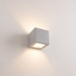
Minimalist cubic grey ceramic wall light

Design graphic black steel wall light, curved arm

Modern globe pendant light, gold steel and glass
See also

Teal Bedroom Ideas: Colours, Gold Accents and the Right Light for a Dark Wall

Downstairs Toilet Lighting: The Right Light for a Small, Windowless WC or Cloakroom

Wabi-Sabi Interior Design: The Beauty of Imperfection, Right Down to the Light
