

Table of Contents
Taupe is a greyish brown, halfway between grey and brown, named after the French word for a mole and the colour of its fur. Depending on how much grey, brown or pink it holds, it runs from a pale taupe close to beige to a deep taupe. It is a warm neutral that is easy to pair and comes alive under warm light.
Taupe has become one of the most asked-for neutrals in Irish homes, and for good reason. It is warmer than grey, deeper than beige or white, and it sits happily with timber floors, linen, wool and stone. On walls, furniture or soft furnishings it gives a room a calm, settled feel, and it adapts to very different styles, from Scandinavian to classic. Natural-toned lighting suits it perfectly: our beige chandeliers and beige pendant lights are an easy match.
This guide covers what taupe really is, its main shades with a colour reference for each, the colours that go with it, the rooms where it works best and, because this is where most taupe schemes succeed or fail, the lighting that shows it at its best.
What colour is taupe?
The word comes from the French taupe, itself from the Latin talpa, both meaning mole. Originally it named only the average colour of the European mole’s fur, a dark greyish brown. A Dictionary of Color by Maerz and Paul, the reference work published in New York in 1930, includes a sample of it. From the 1940s the name spread to a whole range of shades, from light greyish brown to dark brownish grey. That is why two paints both called “taupe” can look so different on the wall.
The reference taupe corresponds to the hex code #483C32: a dark shade, much deeper than what interior design usually calls taupe. In homes, it is mostly the lighter versions you will meet.
Is taupe more grey or brown?
Both at once. Taupe is a grey with brown added, or a brown that has been greyed down. When brown leads, you get a warm taupe that leans towards beige and mocha. When grey leads, you get a cool or greyish taupe, more mineral. That balance explains the huge variety of shades sold under the one name.
Taupe or beige: what is the difference?
Beige is a light shade built on yellow and brown, with no grey: it stays bright and golden. Taupe contains grey, which makes it softer and deeper. Side by side, beige looks warm and sunny while taupe looks calmer and more sophisticated. The two work very well together, with the beige lifting the taupe. Between the two sits greige colour, a greyish beige that is lighter and brighter than taupe.
The different shades of taupe
Taupe is a real chameleon. Its range of shades can bring lightness and softness to one room and depth and character to another. The hex codes below are screen references to help you picture each shade: every paint maker has its own references, so always check the real colour on a sample.
Light taupe: soft and bright
Light taupe is a quietly warm shade, perfect for a restful room. In a small bedroom or a living room short on daylight, it gives a sense of space and brightness and makes the room feel more welcoming. Its neutral, cosy character makes it a safe choice for a scheme that will last. With timber or fabric bedroom wall lights, it makes for a very calm bedroom. Reference: #D8C8B8.
Greyish taupe: elegant and modern
Greyish taupe, often searched for as taupe grey, stands out for its cooler, muted tones. It blends grey and brown for a sophisticated, contemporary look, discreet yet never cold. It suits modern interiors, a minimalist scheme or a calm home office. Reference: #8B7F7A. The “taupe gray” listed in English colour references, #8B8589, is cooler still.
Brown taupe and dark taupe: warmth and depth
Brown taupe is a warm, enveloping shade that gives a room character. Its earthy side creates a welcoming atmosphere, ideal for a living room, especially with solid timber and cosy textiles. Darker again, deep taupe comes close to the original colour: if you love it, keep it for a feature wall, a headboard wall or behind shelving, and light the room generously. References: #674C47 for a brown taupe, #483C32 for the reference dark taupe.
Pinkish taupe: soft and romantic
Pinkish taupe is a warmer, more delicate variation, tinted with pink. Ideal for bedrooms and quiet corners, it brings a comforting mood without being sugary. The idea is not new: “rose taupe” already appears in the Maerz and Paul dictionary, which dates its first use as a colour name in English to 1924. It pairs particularly well with brass, unbleached linen and pale timber. References: #D4A6A1 for a powdery pinkish taupe, #905D5D for the historic, stronger rose taupe.
| Shade | Hex reference | Undertone | Where to use it |
|---|---|---|---|
| Light taupe | #D8C8B8 | Warm, bright | Small rooms, bedroom, whole walls |
| Beige taupe | #927C66 | Warm | Living room, textiles, furniture |
| Greyish taupe | #8B7F7A | Cool, mineral | Modern interior, home office |
| Taupe grey | #8B8589 | Cool | Kitchen, bathroom |
| Brown taupe | #674C47 | Warm, deep | Living room, shelving wall |
| Dark taupe | #483C32 | Neutral, dark | Feature wall, headboard wall |
| Pinkish taupe | #D4A6A1 | Warm, powdery | Bedroom, reading corner |
| Rose taupe | #905D5D | Warm, strong | Accents, textiles |
Warm or cool taupe: which suits your room?
To tell whether a taupe is warm or cool, hold the sample against a sheet of white paper. If it leans towards yellow, orange or pink, it is a warm taupe: it will warm up a north-facing room and sit well with timber, brass and earthy tones. If it leans towards grey or violet, it is a cool taupe: it will calm a very sunny room and pairs with pure white, black and metal.
This test matters more in Ireland than almost anywhere. Our daylight is often soft and overcast, and a north-facing room gets a cool, bluish light for much of the year. Under that light a cool taupe can read as flat grey, while a warm taupe keeps its brown depth. For a north-facing living room, lean warm; save the greyer taupes for bright, south-facing rooms.
What colours go with taupe?
Neutral and nuanced, taupe accepts almost anything: you can play it tone on tone or wake it up with contrast. Here are the safest pairings, from the gentlest to the boldest.
- Off-white and cream: they lift taupe and bring out its warmth. The easiest pairing for a bright room.
- Beige and linen: a very restful tone-on-tone scheme, best with texture such as washed linen, bouclé wool or rattan. Washed linen on taupe is also a classic of wabi-sabi interior design.
- Black: in fine touches, on a light fitting, a frame or furniture legs, it adds definition to a taupe room.
- Dusty pink: it extends a pinkish taupe and softens a greyish one.
- Sage and olive green: two greyed greens with the same gentleness, for a natural feel.
- Blue: from navy to teal, it makes an elegant contrast with warm taupes.
- Burgundy and terracotta: for a richer mood, especially with a brown taupe.
- Brass and gold: warm metals make even the most muted taupes glow.
Where to use taupe in the home
In the living room, a brown or greyish taupe wall behind the sofa gives the room structure without darkening it. Add lighter textiles and a living room chandelier in natural materials, which provides the background light a deep shade needs.
In the bedroom, light or pinkish taupe encourages calm. It works beautifully on the wall behind the bed, with white or linen bedding. If you are unsure, start with that one wall: you can judge the effect before painting the whole room.
In the kitchen, a greyish taupe on the units or walls goes well with timber and a pale worktop, and kitchen pendant lights in wood or opal glass keep the scheme soft. In the bathroom, taupe warms up white tiles and black or brass taps.
In the hall, often the darkest room in an Irish house, a mid taupe looks rich rather than gloomy, provided the ceiling light is warm and generous.

On furniture and textiles, taupe is a safe bet for a sofa, curtains or a rug: it copes with daily life, suits white and coloured walls alike and outlasts trends.
Which lighting brings out taupe?
Taupe changes with the light far more than a clear, strong colour does. Three points make the difference.
Colour temperature
Under warm 2,700 K light, taupe looks browner, softer and more enveloping. Under neutral 4,000 K light, it leans towards grey. For a living room or a bedroom, warm white almost always flatters taupe; for a kitchen in greyish taupe, a neutral white brings out its mineral side. Always test your paint sample in the evening, under your own bulbs, before painting a whole wall.
Colour rendering
The colour rendering index (CRI) measures how faithfully a light source shows the colours of objects. Since 1 September 2021, the EU ecodesign regulation on light sources has required a CRI of at least 80 for general indoor lighting. For a shade as subtle as taupe, a bulb with a higher CRI, often shown as 90 on the pack, renders the pink or grey undertones more faithfully.
Light fittings in natural materials
Linen, felt, pale timber and opal glass extend the softness of taupe. Our designer felt pendant light in natural tones spreads a gentle light over a table, and on the wall a natural wood Scandinavian wall light adds a warm glow at eye level. Natural fibre pendant lights bring a warm texture to a brown taupe interior. Layer a ceiling light, a wall light and a lamp, each at its own height, and the taupe will look different, and better, at every hour of the evening.
Taupe colour: frequently asked questions
What is the colour taupe?
Taupe is a greyish brown, halfway between grey and brown. The name comes from the French word for a mole, and it first described the dark greyish brown of the animal’s fur. Since the 1940s it has covered a whole family of shades, from a pale taupe close to beige to a deep taupe, the reference hex code being #483C32.
Is taupe more grey or beige?
Taupe sits between the two. It contains grey, which beige does not, so it looks softer and deeper than beige, but it also holds brown, which makes it warmer than grey. A warm taupe leans towards beige and mocha, a cool taupe leans towards grey and looks more mineral.
Which colour goes best with taupe?
Off-white, cream, beige and linen are the safest partners: they lift taupe and bring out its warmth. For contrast, use black in fine touches, navy, sage green or burgundy. Brass and gold suit warm taupes, while black metal and pure white suit greyish taupes.
What is the difference between beige and taupe?
Beige is a light shade based on yellow and brown with no grey, so it stays bright and golden. Taupe contains grey, which makes it more muted and deeper. Side by side, beige looks sunny and taupe calmer. They work very well together, the beige lifting a taupe wall or sofa.
What colour is complementary to taupe?
On the colour wheel a warm taupe leans towards orange, so its complement is a blue. That is why navy, teal or a greyish blue make an elegant contrast with it without looking loud. A pinkish taupe pairs in the same way with soft greens such as sage, which sit opposite the pinks.
Does taupe look good in a north-facing room?
Yes, if you choose a warm taupe. North light is cool and bluish, and it can turn a greyish taupe flat and grey. A taupe with yellow or pink undertones keeps its warmth, especially with warm white bulbs around 2,700 K in the evening. Test a sample on the wall at different times of day first.
Sources
- A. Maerz and M. Rea Paul, A Dictionary of Color, New York, McGraw-Hill, 1930: Taupe and Rose Taupe samples. Cited in the Wikipedia article Taupe
- Taupe: etymology, reference hex code #483C32, rose taupe (1924) and taupe gray (#8B8589), widening of the term from the 1940s. Wikipedia
- Commission Regulation (EU) 2019/2020 of 1 October 2019 laying down ecodesign requirements for light sources, Annex II: functionality requirements, colour rendering. EUR-Lex
Related products

Designer felt lamella pendant light, lantern shape
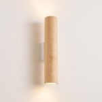
Natural wood Scandinavian wall light
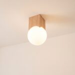
Japandi ceiling light in light wood and opal glass
See also

Flickering Lights: Causes, Warning Signs and How to Fix Them

Bookcase Lighting: How to Light Your Books, Shelves and Reading Nook

How Many Lumens Do I Need? Lumens per m² for Every Room
