

Table of Contents
Wabi-sabi interior design is a way of decorating inspired by a Japanese aesthetic that finds beauty in things that are imperfect, worn and passing. It relies on raw materials (crumpled linen, ceramic, driftwood, clay), earth colours, a few objects chosen for their story, and a soft, filtered light that keeps its share of shadow.
A clay bowl that sits slightly crooked, a limewashed wall with visible patches, a linen sheet that will never see an iron: what a conventional scheme would correct, wabi-sabi keeps. The style is restful, and it does not ask you to buy everything new, only to look differently at what you already own. This guide covers its philosophy, codes, materials and colours, then the element that makes or breaks a wabi-sabi interior: the light.
What is wabi-sabi? A Japanese philosophy before a style
Before it became a decorating trend, wabi-sabi was a way of seeing the world. It has no single-word translation in English: it joins two old ideas that were long kept apart.
Wabi and sabi: two words, one idea
Wabi first described the loneliness of someone living far from society, out in nature. Over time it took on a positive meaning: a quiet, chosen simplicity, contentment with little, elegance without show. Sabi is the mark of time: the patina on metal, the wear on a wooden step, moss on a stone.
Together, the two words describe a beauty that is modest, incomplete and fleeting. The idea is often summed up in three observations drawn from Zen Buddhism: nothing lasts, nothing is finished, nothing is perfect. Wabi-sabi invites you to accept them rather than fight them. The nearest English phrase is “the beauty of imperfection”, which is why the Japanese word is usually kept.
From the tea ceremony to the living room
It was the tea ceremony that gave wabi-sabi its concrete form. In the sixteenth century, the tea master Sen no Rikyū championed a stripped-back practice: a small rustic room with earth walls, and uneven bowls shaped by hand in place of precious porcelain imported from China. Kintsugi, which repairs broken ceramics with lacquer dusted with gold, carries the same spirit: the crack is not hidden, it becomes the most beautiful part of the object.
The word spread in the West from the 1990s, helped by a short book the American designer Leonard Koren devoted to it in 1994. In an Irish home, wabi-sabi style does not mean copying a Japanese interior: it keeps the state of mind, with local objects and materials. A stone cottage wall, a scrubbed pine table and a hand-thrown jug from a craft fair already speak its language.
The principles of wabi-sabi interior design
A wabi-sabi interior is recognised less by a particular piece of furniture than by an atmosphere: calm, a little raw, never cold. Six codes help you build it:
- Imperfection on purpose. A ceramic with an uneven rim, plaster that keeps the mark of the trowel, a split beam: the mark of the hand or of time wins over the production line.
- Empty space. Few pieces of furniture, few objects. The emptiness is not a lack: it lets each object exist.
- Objects with a story. Family furniture, second-hand finds, a potter’s work. A 1950s sideboard earns its place if it has aged well, and mid century modern, with its dark woods and simple shapes, blends in better than you might expect.
- Asymmetry. An off-centre bunch of branches, two vases of different heights, a picture leaning on the floor.
- Nature indoors. A branch, dried grasses, a stone or a piece of driftwood picked up on the beach, often dried rather than lush.
- Quiet surfaces. Few patterns, no gloss: matt finishes that absorb light instead of bouncing it back.
None of this means wabi-sabi is careless: every object is chosen. Modern wabi-sabi keeps clean lines for the furniture and saves the imperfection for the materials and the objects.
Raw materials: crumpled linen, ceramic, driftwood and clay
In wabi-sabi, material counts for more than colour or shape. Leave it visible, as it is, and let it age.
Crumpled linen
Washed linen is the signature textile of wabi-sabi: it creases, softens and gains character with every wash without ever looking neglected. Choose it plain, in natural tones, for bedding, curtains and cushions, and put the iron away. A linen curtain also filters daylight much as a paper screen does.
Ceramic and stoneware
Handmade ceramic is the wabi-sabi object above all others, a direct descendant of the tea ceremony bowls. Raw stoneware, terracotta, a glaze that runs or crazes: choose it matt, with the small irregularities of throwing or firing. It belongs on the walls too: a white ceramic wall light, opaque and matt, blends into a limewashed wall by day and brings it to life in the evening.
Driftwood and raw wood
Wood shows its knots, splits and grain. Raw oak, reclaimed timber, driftwood smoothed by water and salt: the more it has lived, the better. Choose an oiled or waxed finish over a glossy varnish. Driftwood works for lights as well: a driftwood chandelier brings to the ceiling the same weathered material as a branch on a console table.
Clay, lime and stone
On the walls, wabi-sabi swaps smooth emulsion for mineral finishes: limewash, clay plaster, polished concrete. Applied by hand, they keep variations that shift with the daylight. On the floor, stone, terracotta tiles or raw boards. In the evening, these matt surfaces catch the grazing light of a wall light, where a satin paint flattens everything. Avoid plastic, polished chrome, high-gloss lacquer and imitation wood or stone, which break the effect at first glance.
Wabi-sabi colours: greige, ochre, sand and warm grey
The wabi-sabi palette comes from earth, stone and wood. It stays muted, with no bright colour and no pure white, and every shade looks slightly faded, as if the sun had softened it. These are the references we use:
- Lime white, #EDE8DF: walls and ceiling. A mineral off-white that reflects light without the clinical effect of brilliant white.
- Sand, #D9C9AE: linen, rugs, large textiles. The background that warms everything else.
- Greige, #B8AB9A: sofa, curtains, a feature wall. Halfway between grey and beige, it is the most wabi-sabi colour of all; our guide to greige colour covers its shades and pairings.
- Ochre, #B98A4B: ceramics, cushions, a throw. Ochre is a clay coloured by iron oxides, a brownish yellow that warms without shouting.
- Clay, #9C7258: terracotta, dark wood, pottery. The warmest and deepest note.
- Warm grey, #8E877D: stone, concrete, grey ceramics. A grey that leans towards brown, never towards blue.

Grey has its place in wabi-sabi on one condition: it must be warm. A bluish or cold concrete grey tips the room towards contemporary minimalism. To read the undertone of your grey, our guide what colour goes with grey gives a simple method with a sheet of white paper. On the earth side, ochre and clay lead towards brick red: a terracotta bedroom shares many materials with wabi-sabi, in a warmer and more colourful register. A few darker touches, charred wood or aged iron, add depth, and the green of an olive branch or of moss is enough to bring nature in.
Wabi-sabi lighting: washi paper, ceramic and half-light
Light is the most overlooked code of the style, and the one that decides everything. The same room with lime walls, linen and ceramic looks flat under a bright white ceiling light, and gains all its depth under two or three warm, filtered sources that leave the corners in shadow. Wabi-sabi lighting is soft, low and incomplete: it does not try to light everything.
What In Praise of Shadows teaches
The Japanese writer Jun’ichirō Tanizaki described this sensibility in 1933 in his essay In Praise of Shadows. He regrets the harsh electric light then spreading through Japanese houses, and defends half-light, in which lacquer, gold and matt materials reveal their beauty. He contrasts Western paper, which throws light back, with Japanese paper, which takes the light in and holds it softly, like a fall of snow. For Tanizaki, the beauty of a room comes less from the light itself than from the gradation between brightness and shadow.
Carried into a room, this is chiaroscuro, as in a candlelit painting: islands of warm light, and around them a shadow that is not black but inhabited.
Washi paper, which holds the light
Washi is the traditional Japanese paper, made by hand for more than a thousand years from bark fibres, notably those of the paper mulberry. The craft has been on UNESCO’s list of the Intangible Cultural Heritage of Humanity since 2014. It covers shoji sliding screens, hanging lanterns and andon, the paper lamps on a wooden frame that lit Japanese homes before electricity.
Stretched in front of a bulb, paper turns a dazzling point of light into a volume that glows gently all over, with fibres that show against the light. It is the fitting most faithful to the style: our Japanese paper pendant light collection brings together round, oval and pleated lanterns. On a pleated shade, each fold draws a darker rib, and the lit lamp becomes a small chiaroscuro of its own.
Ceramic, which sends light onto the wall
Ceramic is opaque: light does not pass through it, it is steered. A matt ceramic wall light hides the bulb and sends the light up, down or both, drawing a halo on the wall. On lime or clay plaster, this grazing light brings out every patch and every shade. Simple shapes work best, half-moon, globe, cone or rounded rectangle, in biscuit white or warm grey. Our ceramic wall light range offers more than thirty.
Linen and fibres, which soften the light
A linen shade lets through a golden, slightly veiled light and sends most of it downwards, over a table or a bed, without glare. Natural fibres stretched over a frame give a similar effect with a more even glow.

The wabi-sabi light fitting: a pebble shape and a matt surface
Beyond the material, a wabi-sabi light is recognised by its shape: the outline of a pebble or an upturned bowl, slightly irregular, with a matt surface that recalls raw earth or plaster. Switched on, it does not show the bulb: the light comes out underneath and lights the inside of the shell. Our minimalist Japanese wabi-sabi pendant follows this idea, with a matt white shell and a warm yellow interior, from 30 to 60 cm across.
Choose the diameter to suit the space: 30 to 40 cm above a small round table or a bedside, 50 to 60 cm above a large dining table or in the middle of a living room. Three small pendants hung at different heights make an asymmetric cluster that is very wabi-sabi.
Setting the half-light: three pointers
Very warm light. Choose warm white bulbs around 2,700 K, the shade of the old incandescent bulb. Amber filament bulbs come closer to candlelight, which sits around 1,850 K. Above 3,000 K, earth, linen and wood lose their warmth. Check the cap before you buy: many Irish lamps take a B22 bayonet bulb, while most of our ceramic and paper lights take an E27 screw bulb.
Low sources and dark corners. Bring the light down to eye level or below: a pendant over the table, a wall light by the armchair or the bed, a lantern on the floor. A dark corner gives depth to the lit one.
Adjustable brightness. A dimmer switch takes you from working light to evening half-light with the same fittings, as long as your LED bulbs are marked dimmable and the dimmer is designed for LED.
Wabi-sabi room by room
Wabi-sabi bedroom
The bedroom is where wabi-sabi comes most easily: a low bed on a raw wood platform, washed linen bedding in sand or greige, a thick wool throw, and a bedside table reduced to a stool or a tree stump. On the walls, limewash or a matt mineral paint, and one piece of art, or nothing.
The bedroom lives mostly in the evening, so the light matters more here than anywhere. Swap the bedside lamps for two ceramic wall lights either side of the bed: they free up space and put two halos on the wall. Keep the ceiling light for tidying, and switch it off at dusk. Adding new wall light points is work on the fixed wiring: in Ireland it is a job for a Registered Electrical Contractor, working to I.S. 10101.

Wabi-sabi living room
A low sofa in linen or raw cotton, a coffee table in solid wood or stone, a jute or undyed wool rug, and a few chosen objects: a ceramic, a piece of driftwood, dried branches. For the light, a large paper lantern over the coffee table and a wall light by the sofa are enough. In an Irish living room with a single central light point, a paper shade on that point and one low lamp already change the whole evening.
Wabi-sabi kitchen and dining room
In the kitchen, the style comes through the materials: raw wood or matt cupboard doors, a stone or concrete worktop, stoneware on an open shelf. Over the table, a paper, ceramic or pebble-shaped pendant, hung low, creates the island of light around which everyone gathers. Keep a brighter light, hidden under the wall cupboards, for the worktop.

Wabi-sabi vs Japandi: what is the difference?
The two styles are often confused, since they share natural materials, handmade objects and restraint. Japandi even grew partly out of wabi-sabi. But they do not tell the same story:
| Wabi-sabi | Japandi | |
|---|---|---|
| Origin | An old Japanese aesthetic, linked to Zen and the tea ceremony | A recent decorating style, where Japan meets Scandinavia |
| Spirit | Accepting wear, imperfection and the passing of time | Calm, order and comfort |
| Colours | Earth: greige, ochre, sand, clay, warm grey | Warm neutrals, pale wood, touches of black and green |
| Materials | Raw and weathered: lime, clay, driftwood, crumpled linen | Natural but neat: light oak, paper, linen, matt ceramic |
| Shapes | Irregular, organic, asymmetric | Straight lines with softened corners, low furniture |
| Objects | Found, old, handmade, sometimes mended | Few, often new, chosen for their design |
| Light | Half-light, chiaroscuro, very warm sources | Warm, diffused, from several points |
Wabi-sabi is rawer, darker and earthier; Japandi is smoother, lighter and tidier. The two mix without trouble: a Japandi base turns wabi-sabi as soon as you add limewash, an irregular ceramic and a lower light. For the codes and lights of the other style, see our guide to Japandi style. And if you like pale wood but want more brightness than half-light, Scandinavian style is the lightest of these neighbouring styles.
Wabi-sabi interior design: frequently asked questions
What is wabi-sabi style interior design?
A way of decorating drawn from a Japanese aesthetic that values the imperfect, the worn and the passing. In practice it means raw, matt materials such as crumpled linen, handmade ceramic, driftwood and lime or clay plaster, earth colours, few objects chosen for their story, and a soft, low light that leaves part of the room in shadow.
What are the 7 principles of wabi-sabi?
The seven principles often quoted come from the Zen aesthetics described by the Japanese philosopher Hisamatsu Shin’ichi: asymmetry (fukinsei), simplicity (kanso), austerity (kokō), naturalness (shizen), subtle depth (yūgen), freedom from convention (datsuzoku) and tranquillity (seijaku). In a home they translate into loose compositions, empty space, raw materials and a calm, dim light.
What are wabi-sabi colours?
Earth colours, muted and warm: lime white for the walls, sand and greige for textiles and furniture, ochre and clay for ceramics and terracotta, and a warm grey that leans towards brown rather than blue. Avoid brilliant white and bright colours, and judge each shade in the evening under warm white bulbs.
Are Japandi and wabi-sabi the same?
No. Wabi-sabi is an old Japanese aesthetic built on accepting wear and imperfection, with raw materials, earth colours and a dim light. Japandi is a recent decorating style that blends Japanese and Scandinavian design, smoother, lighter and tidier. The two mix well: a Japandi room turns wabi-sabi with limewash, irregular ceramics and a lower light.
What is the English equivalent of wabi-sabi?
There is no single word for it. The closest phrases are “the beauty of imperfection” or “the beauty of things imperfect, impermanent and incomplete”. Wabi covers a quiet, chosen simplicity, and sabi the patina that time leaves on things, which is why the Japanese word is usually kept.
What bulb should I use for wabi-sabi lighting?
A warm white LED around 2,700 K, or an amber filament LED for a glow closer to candlelight. Choose a frosted bulb if it shows through paper or fabric, and a dimmable one if the light is on a dimmer switch. Check the cap and the maximum wattage on the product page: many Irish lamps take B22, many modern fittings E27.
Sources
- Wabi-sabi, encyclopaedia article (origin of the two words, the tea ceremony, Sen no Rikyū, spread in the West, Leonard Koren’s book of 1994). Wikipedia
- Japanese aesthetics, encyclopaedia article (the seven characteristics of Zen art described by Hisamatsu Shin’ichi). Wikipedia
- In Praise of Shadows, encyclopaedia article on the essay by Jun’ichirō Tanizaki (1933). Wikipedia
- Washi, encyclopaedia article (bark fibres, paper mulberry, uses in shoji and lanterns, inscription in 2014 on the UNESCO list of the Intangible Cultural Heritage of Humanity). Wikipedia
- Kintsugi and Colour temperature, encyclopaedia articles (gold lacquer repair; candle flame and incandescent lamps). Wikipedia
- Home Safety: always use a Registered Electrical Contractor for electrical works. Safe Electric
Related products

Globe-shaped white ceramic wall light
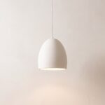
Minimalist white ceramic pendant light
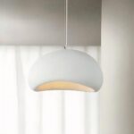
Minimalist Japanese Wabi-Sabi Style Pendant Chandelier
See also

Flickering Lights: Causes, Warning Signs and How to Fix Them

Bookcase Lighting: How to Light Your Books, Shelves and Reading Nook

How Many Lumens Do I Need? Lumens per m² for Every Room
